
University updates signage across campus
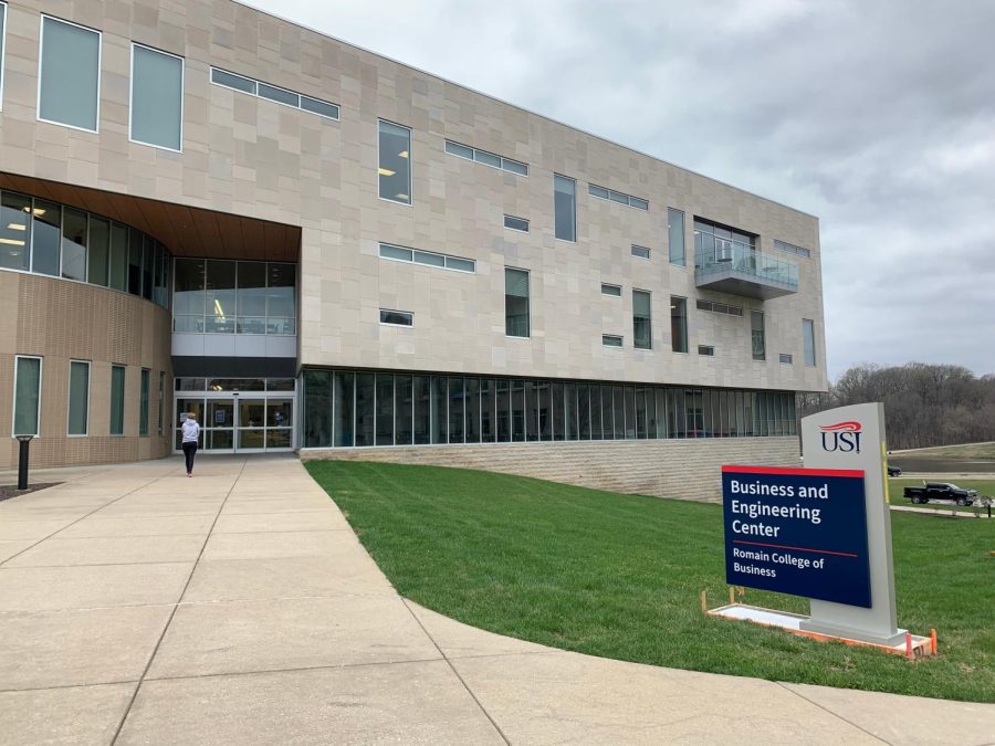
A new sign on display for the Business and Engineering Center.
March 28, 2023
Wednesday Update: The sign in front of the David L. Rice Library and Recreation, Fitness and Wellness center on the median of University Boulevard was reported to be misspelled. “Library Drop-Off” on the sign was misspelled to “Libray Drop-Off.”
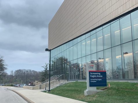
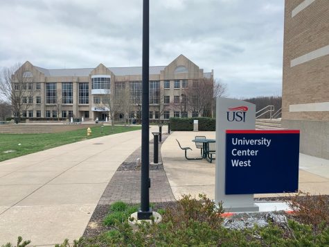
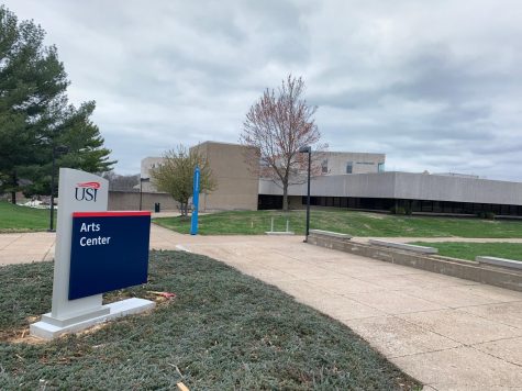
The university updated the signage across campus over the weekend.
The new signs are in front of each building on campus, in the parking lot and outside the residence halls. Not all of the former signs have been replaced yet.
Jim Wolfe, director of facilities operations and planning, said the plan for updating the campus signage began in 2017.
“When we did the master plan back in 2017-18, we put signs out there as a discussion point,” Wolfe said. “The master plan team hired Corbin Design, which specializes in signs for campuses and all kinds of places.”
Wolfe said the large number of signs made it difficult to determine where they should be located on campus.
“There’s like 475 signs all together, so that was very complicated to map,” Wolfe said. “We walked all the sites, agreed on the locations and then they came up with the designs.”
He said the COVID-19 pandemic delayed the development of the new campus signage.
“We’re finally getting them in place. COVID caused a delay. We halted everything when COVID started because we didn’t know what the future was going to bring. Luckily, we are back to about where we were before.”
Wolfe said the project cost around $700,000. The project was funded by leftover money from the university’s overall budget each year, called the Special Projects fund.
Jessica Shearer, senior art interactive media design major, said the updated signs are a lot easier to see.
“I think they’re cool,” Shearer said. “Now you know what building is what because I know that as a freshman on campus, I didn’t really know where to go. I could just look at a map, but this is a lot easier to just see it on every single door and know what parking lot is where because the only way to see it before was on the map, and now you actually have a sign by the parking lots to see where to go.”
Christian Schmitz, senior public relations and advertising major, also said he thinks the new signage is easier to read than the former signage.
“It caught me off guard when I was pulling into the parking lot,” Schmitz said. “I just noticed these big signs, and they were super easy to read. I feel like I never really noticed the old signs. I think the new addition was very nice because you could see the colors, and it was showing which section was for who very easily and very clearly, so I think it’ll be good for guests and newcomers that are used to parking, or freshmen.”
Schmitz said the new signage will allow students to recognize buildings and lead people in the right direction.
Amanda Meuth, junior photography and graphic design double major, said she thinks the new signage is cool because it is “not all broken” like the former signage.
Shearer also said the former signage was broken.
“Some of them were old and breaking down, especially the one at the Art Center was starting to fall apart,” Meuth said. “I think it’s a great upgrade.”
Schmitz said he prefers the new signs to the old signs.
“The old signs were kind of harder to read, and then like, there wasn’t any real color,” Schmitz said. “I felt like it was just black and white and kind of boring. Nobody really paid attention to them, and the new signs are all bigger, so I definitely prefer the new ones.”